Modernizing the CoStar Product
OVERVIEW
During Summer 2022, I had the opportunity to collaborate with two fellow UX design interns on a project aimed at aligning the CoStar Properties product with the newly introduced Cosmos design system. I undertook the task of redesigning specific tabs within the product to enhance their ability to address user needs effectively.
BACKGROUND
Team: Anna Wei, Jenna Marhburk, and CoStar Product Design Team
Timeline: June 2022 - August 2022
Goal: Update outdated UI and UX restricted the users from using the product in an efficient manner
THE SOLUTION
Increased typeface + line spacing allowed for easier readability
- Conforms to AAA Accessibility Standards
- Easier skimmability allows customers to access information quicker
- New look = new feel to an “older” product
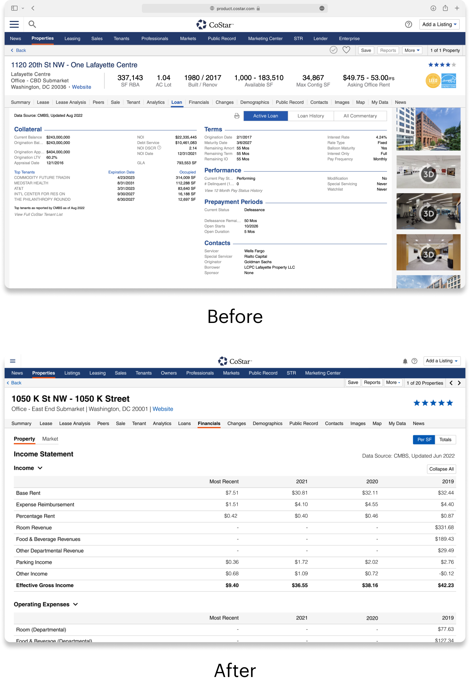
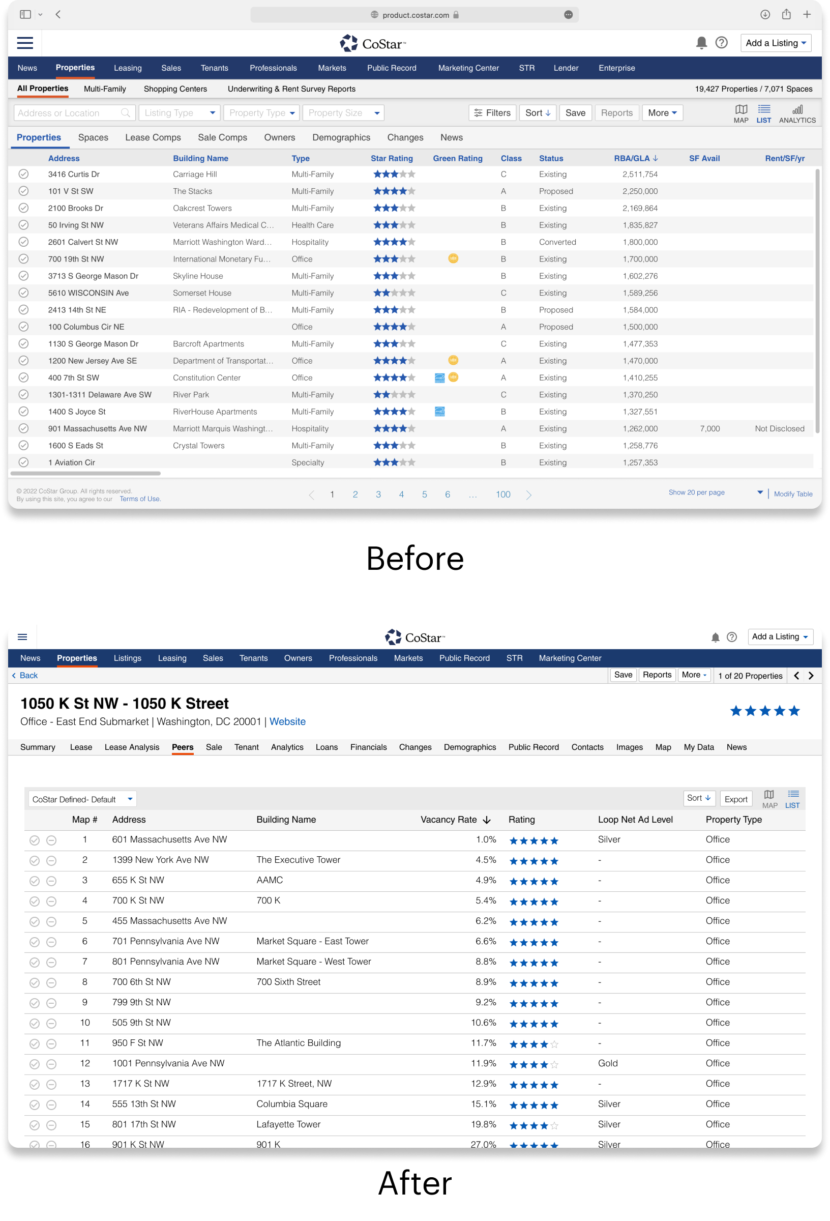
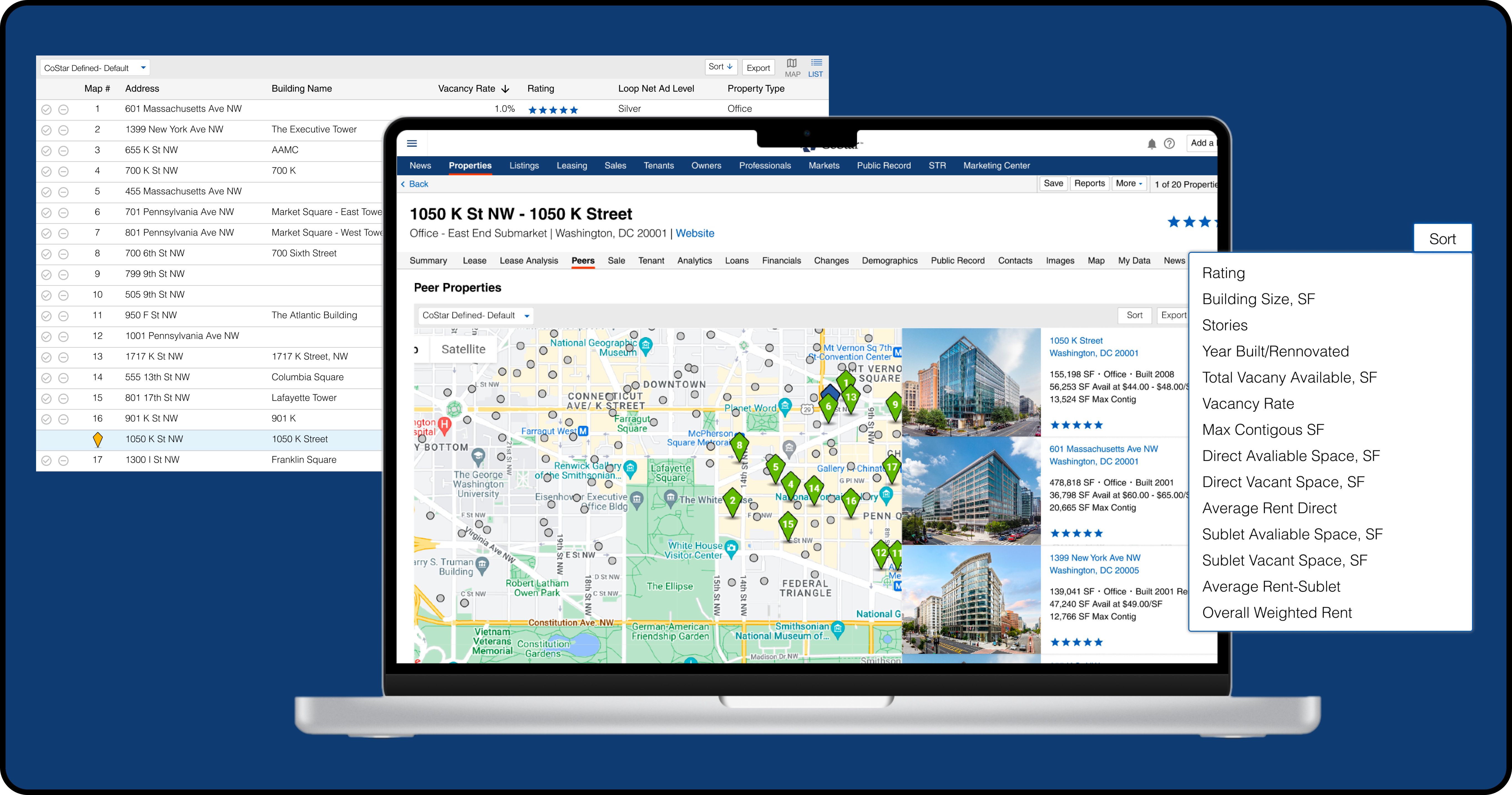
Leveraged current features within the product to reimagine functionality of the page
- Allows easy customization of Peers set
- Compare property against peers along multiple KPIs
GETTING TO KNOW MY USERS
Meet with Internal CoStar employees to better understand the projected use of the product
Due to time and other constraints I was unable to talk with customers directly. Instead, I talked to the next best people, CoStar employees who were client facing, such as Project Managers and Sales Associates.
-
For each of my assigned pages, I scheduled meetings with employees who could answer my 3 basic questions:
- What is the purpose of this page?
- Who uses this page?
- What changes do you want to be made?
For this case study, I am going to specifically focus on the Peers page.
GATHERING INDUSTRY INSIGHTS
No customization or comparability function on Peers page
After speaking with the previous project manager of the Peer page, I was able to gauge that the purpose of the Peers page was to allow users to compare their property against similar “peers” properties
-
The biggest areas of improvement were:
- Visual disconnect between Map and List View
- Limited comparison functionality
I saw an opportunity to increase the user value of this page 10 fold because comparison is a huge advantage within the commercial real estate industry. My goal for this redesign was to increase the ability of the user to quickly customize their peer set, as well as compare their property among chosen metrics.
DEBATING MULTIPLE DESIGN DIRECTIONS
Utilizing the Proximity Principle to increase feedback
I noticed right away that the table and map view were extremely far apart which made it hard for users to connect them mentally, and as a response made it impossible to visualize their changes to the peer set.
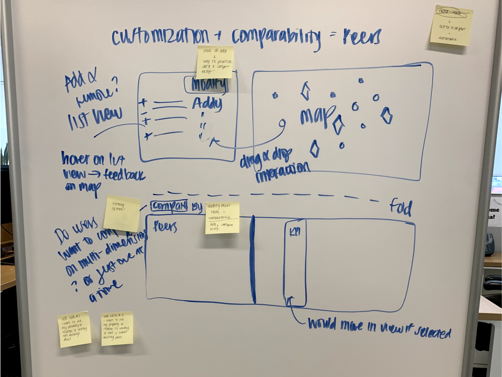
As you can see, there was limited vertical space on the page due to width of the map and columns. After a design review with my manager and a group of senior designers, I went back to the drawing board and rethink how to strengthen this visual connection.
SWITCHING TO FOCUS ON COMPARABILITY
Increasing value add by increasing user options
Somewhat stuck, I decided to take a step back from trying to tackle customization and move towards working on comparability. I designed a Compare By drop down that would allow users to select a metric.
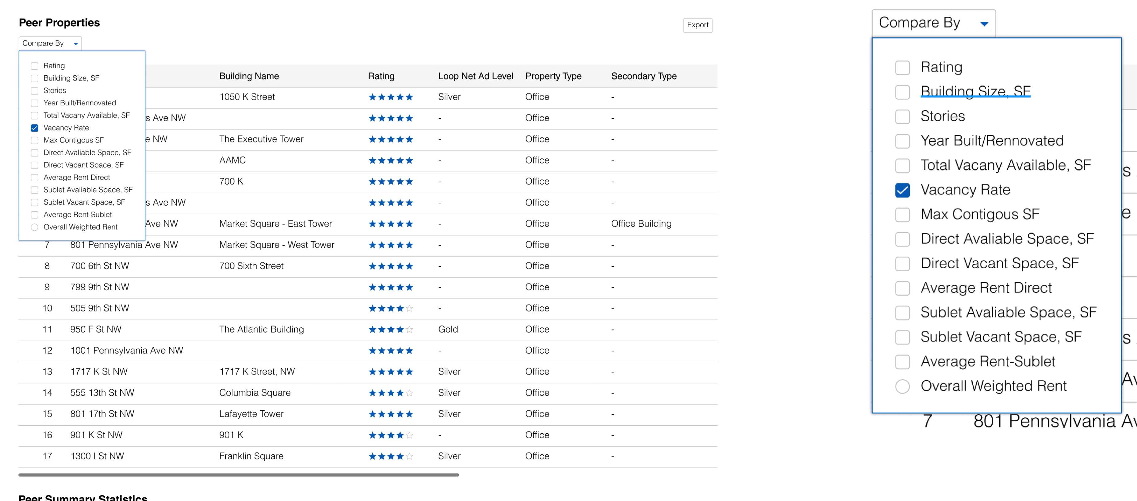
During my second round of feedback, my managers pointed out that the Compare By functionality already existed within the product. However, it was instead referred to as the Sort button.
Immediately I saw the benefits of leverage existing functionality. While fleshing out this idea, inspiration struck!
LEVERAGING CURRENT FUNCTIONALITY OF THE PRODUCT
Adding toggle feature of list and map view
Instead of visually trying to create a new connection between the table and map view, I could leverage an existing feature of the product to achieve this goal. On the properties home page, there is a toggle feature that allows users to switch between map and list view. This feature would remove all the obstacles in my previous designs, namely too little vertical visual space.
